eCommerce website | 2016

consumer cellular

The Story

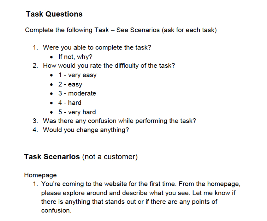
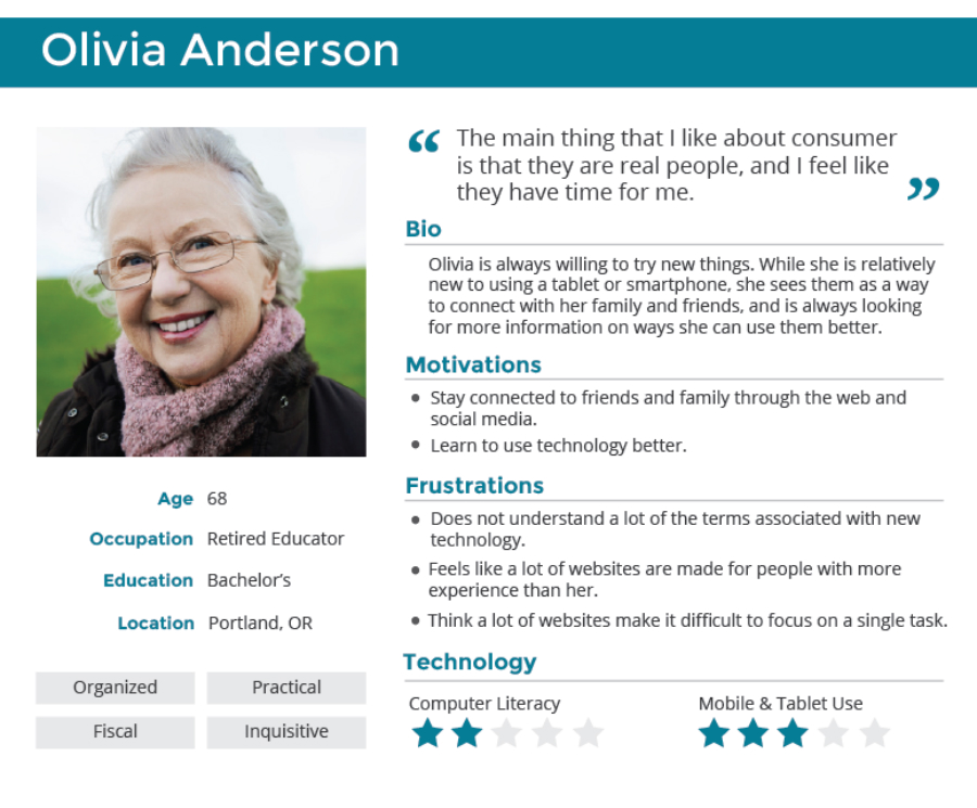
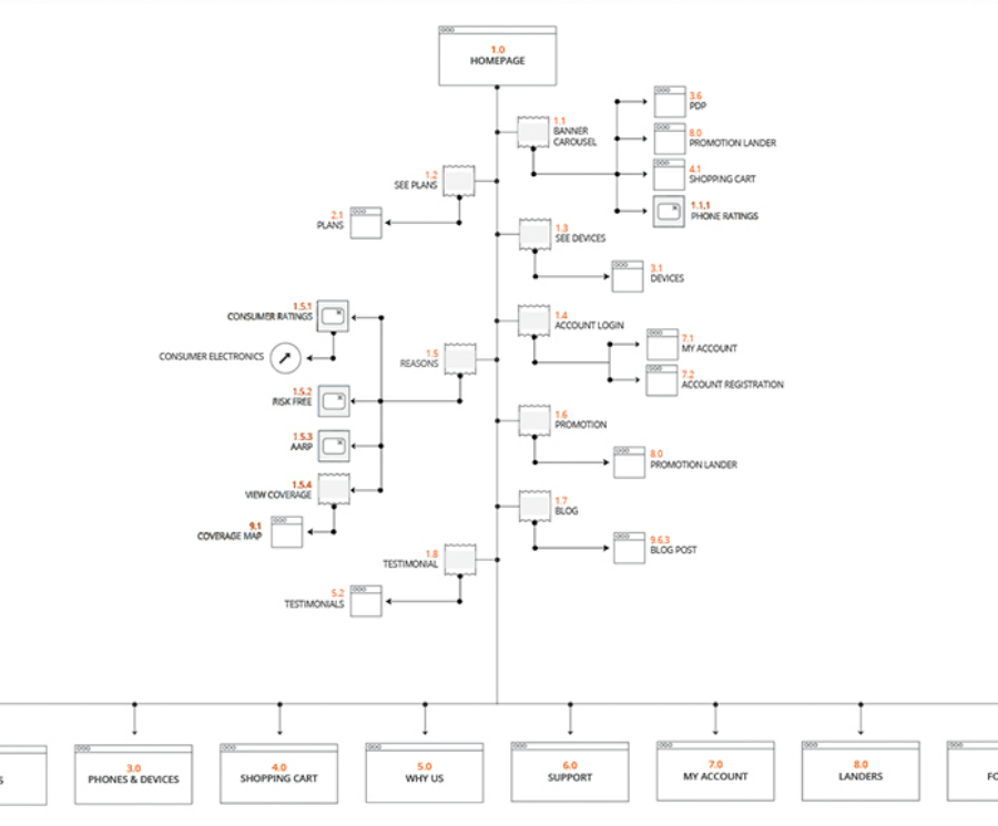
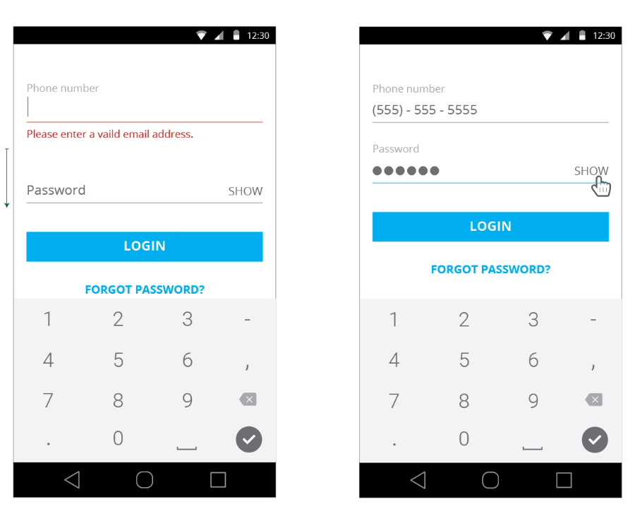
I led the redesign of Consumer Cellular’s website, unifying the desktop and mobile experiences into a fully responsive site that improved usability, reduced maintenance overhead, and aligned messaging across all touchpoints. By conducting user testing, refining information architecture, and redesigning the mobile app, we improved self-service options, reduced customer support calls, and delivered a site with a 40% lighter footprint and improved accessibility.

The Challenge

ConsumerCellular's old website was previously split between a desktop and mobile version. This created a very inconsistent experience for users and was difficult for the IT team to maintain. The company needed a new, responsive website that delivered a great experience to users, while improving the efficiency of the development work needed.

User testing

As part of the discovery process, I conducted a series of user testing on both ConsumerCellular's mobile app and website to help inform the early stages of design. This not only contributed to our ability to develop personas, but it also help to achieve a series of baseline usability metrics going into the redesign process.

Personas

To help drive our design strategy, I created a series of personas that incorporated what we learned form our user testing. This helped to create empathy with stakeholders, as well as ensure we were constantly considering the needs and limitations of our user groups. As older adults are the company's main demographic, this also help to drive the conversations and considerations around accessibility on the site.

Information architecture

The current site had inconsistent language and messaging, as well as a labeling system that did not align with the user's mental model. I created a detailed site map of their current site to help identify any redundant or outdated features. This allowed us to be judicious in eliminating unecessary content, reducing the cognitive load on the user as they scanned through the site. We also worked to update the navigation labels to better align with user's expectations.

Mobile design

As a means of supporting the site redesign, I also redesigned their mobile app so users could more easily log in. We learned in our testing that many users were having trouble utilizing the mobile app. Additionally, many of those users were calling customer service for tasks they could complete in the app. By working to eliminate the pain points for users, we were able to reduce the number of calls coming into customer service regarding basic account features.

Wireframes

In order to create a fully responsive site, there were many design considerations that needed to be addressed. I worked closely with their marketing team to ensure that any features on the site were designed from a mobile-first methodology, and provided solutions that aligned with our development framekwork. I designed all of the wireframes for the site and leveraged a responsive framekwork to address the functionality and layout of the new website.

Final design

The new site was fully responsive, provided more clear self-service options for user support, and had a 40% lighter footprint. Additionally, we worked to ensure a base level of 508 compliance for the site, making it easier for our users to read the content and interact with the features in a flexible and intiuitive way. The unified experience ensured that the company's messaging was aligned across all of their touchpoints, and the development team was able to spend less time performing updates and maintenance.

More work