Healthcare website | 2017
eocco
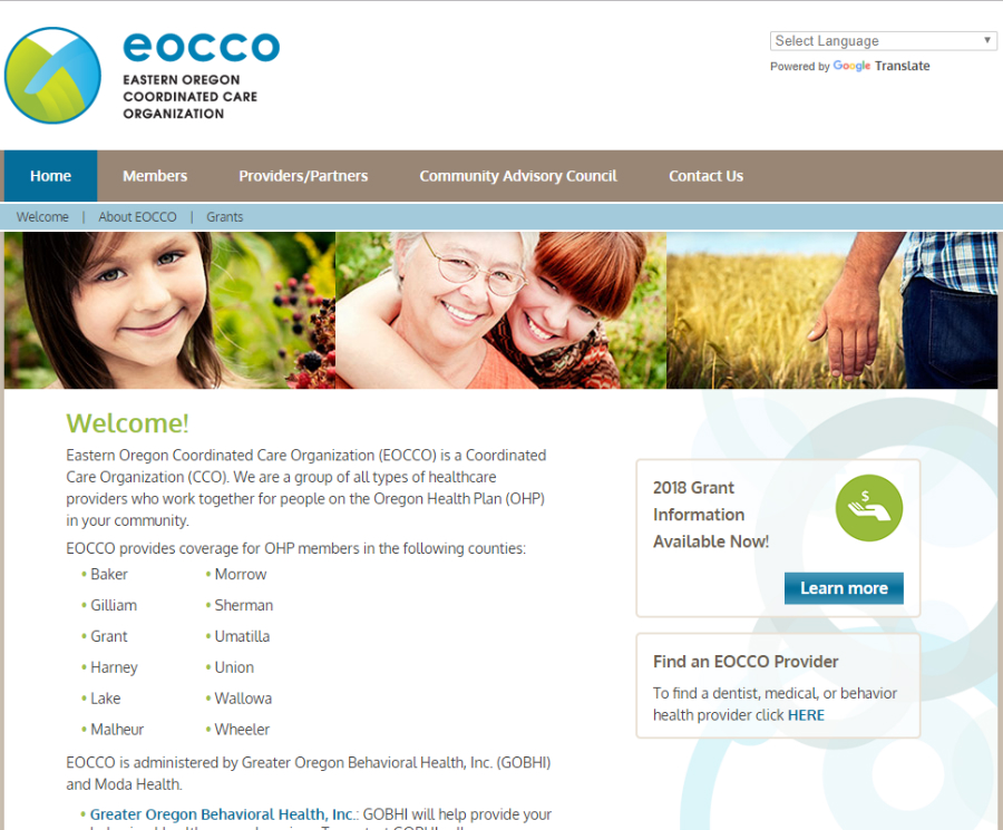
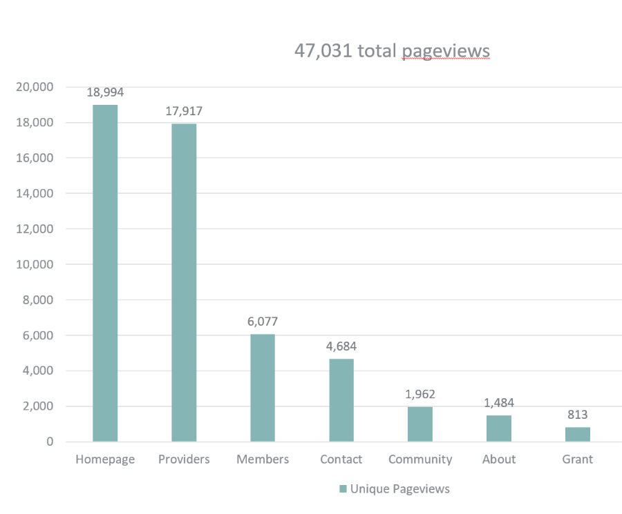
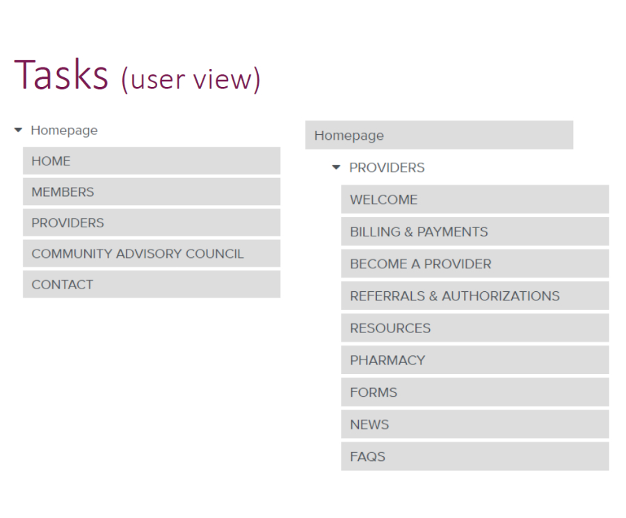
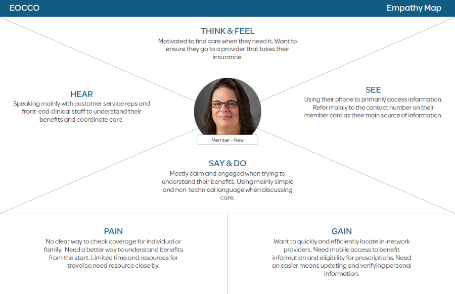
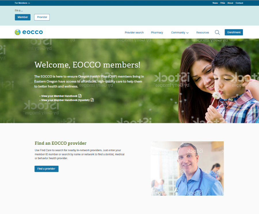
The Story
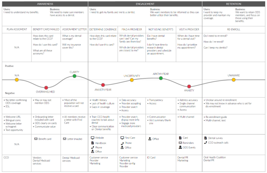
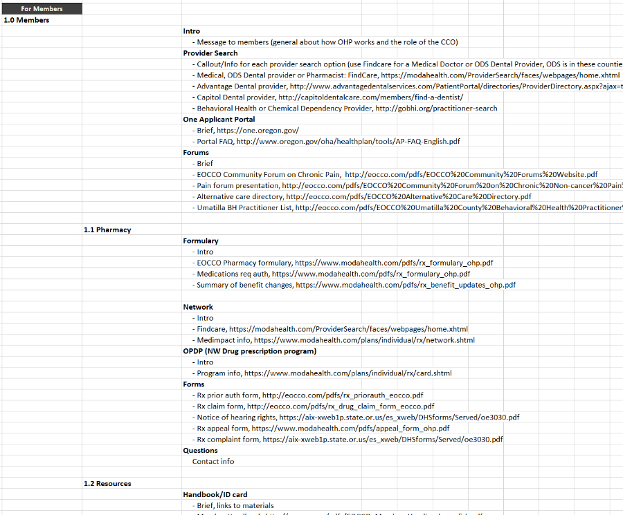
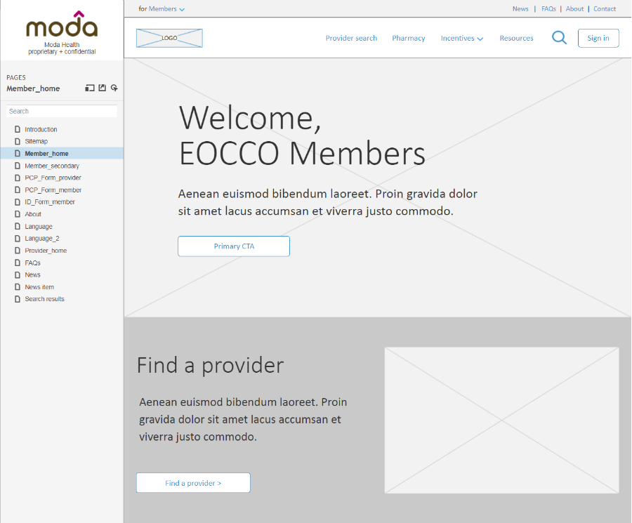
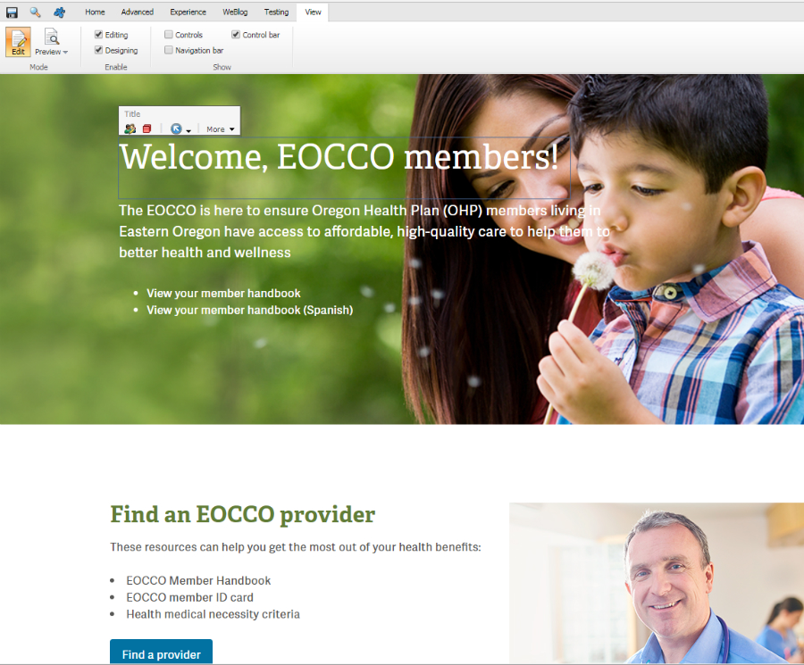
I redesigned EOCCO’s website to create a more intuitive, mobile-friendly experience that addressed user frustrations with navigation and content discovery. By restructuring the information architecture, implementing audience-specific content, and migrating to a CMS for easier updates, we reduced customer service calls, improved provider access to critical forms, and delivered a modern, responsive design that aligned with user needs.